Developing a Night Painting
I wanted to use the Watercolour Curious New Year’s Palette to paint a night scene to show off the dark colours that can be mixed with this palette. These darks are perfect for representing the contrast of warm insides and cool outsides. I wanted the light to rake across the page to help move the eye, and I wanted to try to show off the darker versions of the colours on this palette.
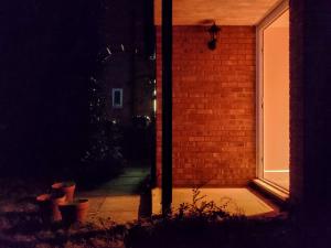
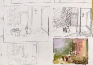
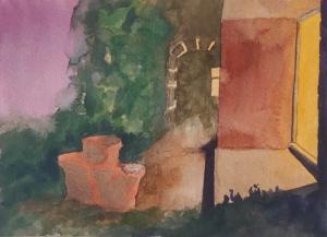
I started with this reference of an open front door at night, with warm light from inside spilling across the garden. Working from this image, I drew some small thumbnails to test out the shapes and balance of values. I have kept the overall geometry of the scene, just made the pots larger so they become more of a focus, and changed the windows in the background to be better composed. However, I have taken a lot of liberty with the colours, even manufactured a sunset, and I think this makes the final image much more compelling.
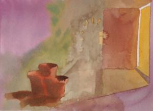
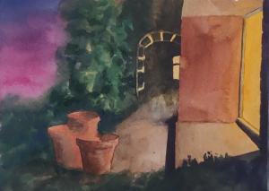
I started with a very light pencil drawing on the watercolour paper to make sure I’d get the perspective correct, and then slowly started to build up layers. In the first layer, I just wanted to get paint over the whole page. I’m starting to think about where light and shadows will be, and about setting complementary colour pairs beside each other.
In the next layers, I’m building up the darks in the foliage and in the far background. I’m starting to think about depth and spaces. I want the area in front of the door to be a distinct space, and I want the space far in the back to seem distant. I’m thinking about yellow/purple contrasts, and using a very dark purple for the bricks of the house around the door, and for the shadows under the step.
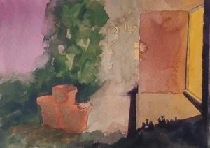
In the next passes, I’m continuing to darken everything, adding the vertical support by the porch, darkening and blurring the far window and the reflections on the arch, and dulling the sunset just a bit. I’m trying to reduce the details in the background, the far window and the arch, to signal that they are far away and in a different space than the porch.
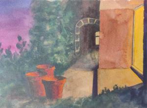
Almost there. The pots have ended up floating a little, so I’ve made the shadows they cast be longer and more pronounced. The sunset is a bit too bright in the background. The purple back there plays an important role, but it’s not the star of the show, so I’ve added a grey wash over it to dull it.
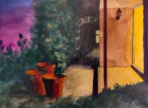
As the final touch, I added a lot of the Cobalt Turquoise into the shadows of the pots and slightly less into the other shadows. I love the contrast made by the sienna of the pots and the deep teal that’s made by putting the opaque turquoise over the black underpainting.
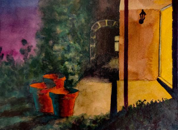
Overall with this I think I’ve achieved the goals I set out to – the light comes across the image and helps move the eye. The darks are interesting and contain a lot of different colours. I’ve tried to avoid becoming too tight on the details especially in the background. There are some nice areas of local contrast, like where the red pots are contrasted by the green foliage behind them. The painting shows off the warm yellow and sets it off against a range of purples, especially the dark purple right next to it and the bright purple on the left.
If you’d like to have a go painting a scene like this, you can get the exact paints I used in the Watercolour Curious New Year’s Palette. Whether you use the kit or not, if you make something in response to this post, I’d love to see it! Tag me @helencook.
Happy painting, Helen
Previous Next