24 Colour Palette
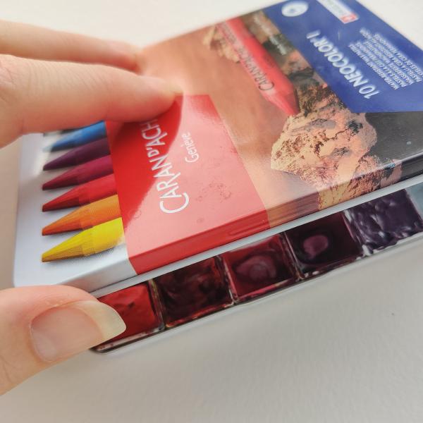
Crayons? Nope, just repurposing this old tin for a new watercolour studio palette. The tin is the perfect height to fit pans, and a bit of kneadable eraser makes up the difference in length and width. This palette is all lightfast, non-granulating, transparent single pigment watercolours with 16 high chroma colours in the outer ring and 8 muted colours in the inner ring. I might put some white gouache or maybe a mixed neutral tint in the middle spot.
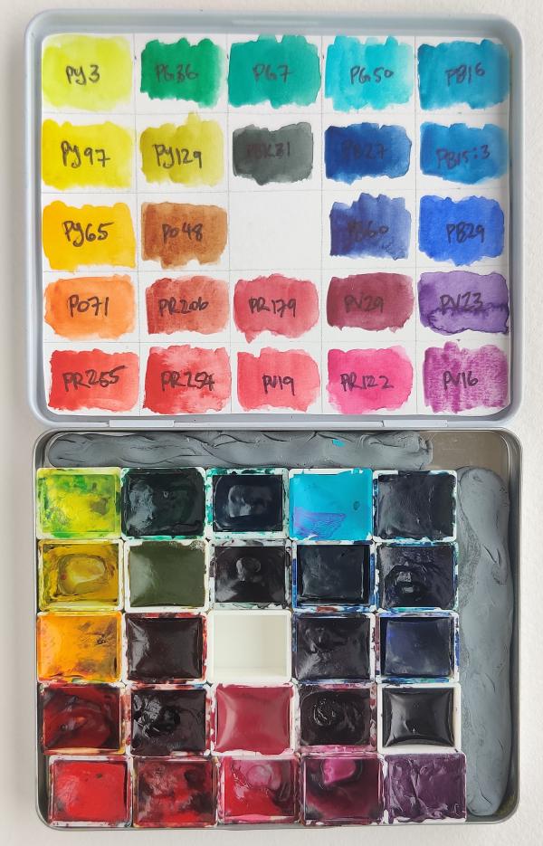
My colour choices counterclockwise:
- PY3 – A cool yellow, I might replace it with PY175 when I use up this pan because the PY3 is the least lightfast of all the colours on this palette.
- PY97 – Mid yellow, I use this a lot but might swap it out for the more transparent PY150 eventually.
- PY65 – Deep yellow, lovely with purples.
- PO71 – I’ve been using this a lot lately, I really like the muted red it makes with PY122, but I might swap it out for the more saturated and more red PO64.
- PR255 and PR254 – The pyrrole reds, scarlet and mid red respectively. good replacements for cadmiums, I think.
- PV19 violet shade – I may replace this with the more saturated red shade, but this hue sits nicely between the red and magentas beside it.
- PR122 – An amazing bright magenta. Mixes beautiful muted turquoises with PG36.
- PV16 – The most granulating colour on this palette, chosen over cobalt violet which is toxic and always seems to be a goopy consistency.
- PV23 – This is a new one to me. I don’t usually use purples, but I’m giving it a try.
- PB29 – Classic ultramarine. A fine ground by Daniel Smith to not granulate as much.
- PB15:3 – Another classic, bright mid blue that mixes good greens and purples.
- PV16 – Phthalo turquoise, might sub this out for manganese blue hue PB15:0 which is more of a bright cyan.
- PG50 – Turquoise, the only cobalt on this palette, which I’d love to sub for something less toxic, but choices are limited in this hue.
- PG7 – I usually use Viridian PG18, but chose this to not granulate.
- PG36 – I prefer this over PG7, which I immediately always add yellow to. Why not just start with a yellower shade?
And the inner ring, the desaturated colours:
- PY129 – Green gold, I love this colour.
- PO48 – Quin orange, I love this colour too.
- PR206 – I heard some manufacturers are discontinuing this, so I’m giving it a go to see if I need to stock up.
- PR179 and PV29 – Perylene maroon and violet respectively. I love how buttery these pigments are especially the violet.
- PB60 – My favourite muted blue.
- PB27 – Prussian blue, giving this one a try.
- PBk31 – Perylene green, an green so dark it’s named a black pigment. It mixes really lovely shadows with PV29.
I chose to not go with any earth pigments in this one because I’m trying to avoid granulation and opacity. However, if I wasn’t, the transparent ochre and sienna from Schmincke would be good candidates to include.
As is probably obvious, the colours are arranged more or less how you would find them on the colour wheel, in order of hue and with the desaturated colours on the inside. Since the neighbouring pans on this palette are analagous, I’m interested to see what would happen if I used a brush larger than a half pan to get bonus bits of the neighbouring colours on the edges. I think it could help add variety and interest to a painting. I’ll have to try it out.
Now that I have these colours set, or mostly, I can move on with the next project: mixing the cross product of them, all with all. The mixes will look like this, with 9 hue steps between the pigments, each at 3 different values.
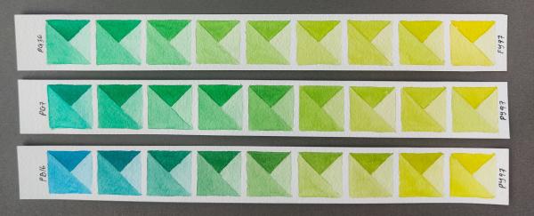
Mixing just the 16 saturated pigments in the outer ring with each other will be 112 swatches, and I have 16 done already. It’s going to take a while to finish them all. I’ll keep you posted.
Previous Next